Appearance Customization

  • Create folder pbxwebai inside folder pbx

    • .../pbx/pbxwebai
  • Inside of folder pbxwebai create folders img and css

    • img folder : That's where all the non-default images should be placed
      • ../pbx/pbxwebai/img
    • css folder : That's where the appearance.css should be placed
      • ../pbx/pbxwebai/css
  • Login to the PBX as admin, navigate to Settings → Network → Ports and allow system to read global files

globalfiles.png

appearance.css

consists of the CSS3 variables we are using to assign colours, shapes and other stylistic properties to DOM elements globally.

Just place appearance.css into css folder as instructed above and start customizing.

:root {
/*MAIN THEME COLORS*/
--primary-color: #f8f8f8;
--secondary-color: #FFFFFF;

--h1-color: #4A4A4A;
--h2-color: #000;
--h3-color: #4A4A4A;

/*SUPPORTING COLORS*/
--well: #FDFDFD ;
--shadow: ;

/*FORM*/
--form-border: #D4D4D4;

/*NAVIGATION*/
--nav-main-color: #222;
--nav-font-color: grey;
--nav-font-hover-color: #3a93f6;
--nav-font-active-color: #3a93f6;
--nav-third-level-color: grey;

--nav-header-info-color: #fff;


/*BUTTONS*/
--button-text-color: #FFFFFF;

--button-primary: linear-gradient(to bottom, #3a93f6 0%,#1a5196 100%);
--button-primary-border: 1px solid #1a5196;
--button-primary-hover: linear-gradient(to bottom, #1F83F3 0%,#0e4284 100%);
--button-primary-active: linear-gradient(to bottom, #2478c1 0%,#082a55 100%);

--button-secondary: linear-gradient(to bottom, #b8b8b8 0%,#888888 100%);
--button-secondary-border: 1px solid #a9a9a9;
--button-secondary-hover: linear-gradient(to bottom, #adacac 0%,#605E5E 100%);
--button-secondary-active: linear-gradient(to bottom, #969696 0%,#515151 100%);

--button-danger: linear-gradient(#d30000 0%, #840000 100%);
--button-danger-border: 1px solid #af3131;
--button-danger-hover: linear-gradient(#c10000 0%, #840000 100%);
--button-danger-active: linear-gradient(#af0000 0%, #720000 100%);

/*MODAL*/
--modal-header: linear-gradient(to bottom, #3a93f6 0%,#1a5196 100%);
--modal-header-text-color: #fff;

--modal-body: #FFF;
--modal-footer: #FFF;
--modal-delete: #C70000;

/*Modals create/add/save will have the header background of btn-primary.*/

/*SCROLLUP*/
--scroll-up-main: rgba(202, 202, 202, 0.4);
--scroll-up-main-hover: rgba(202, 202, 202, 0.7);
--scroll-up-secondary: #222222;

/*FANCY CHECKBOX*/
--checkbox-main-color: #fff;
--checkbox-border-radius: 4px;
--checkbox-inner-border: 1px solid #ddd;
--checkbox-hover-inner-border: 1px solid #ddd;
--checkbox-check-color: #3a93f6;
--checkbox-transition-speed: .3s;
--checkbox-box-shadow: inset 0 0 1px 0 #adadad;
--checkbox-hover-box-shadow: inset 0px 0px 5px 0px #adadad;

/*Font Awesome colors*/
--fa-star-color: #ffa900;
--fa-play-color: green;
--fa-sign-out-color: #3a93f6;

/*Glyphicons colors*/
--glyphicon-ok: green;
--glyphicon-warning-sign: #d4b435;
--glyphicon-remove: #c70000;

/*Table*/
--table-border-top: 0px solid #ddd;

/*Large (1199<)*/
--font-l: medium;
--btn-font-l: medium;
--h1-l: xx-large;
--h2-l: x-large;
--h3-l: large;
--label-l: medium;

--input-field-l: 26px;
--toggle-button-l: 30px;

/*To be added*/
--check-box-l: 22px;
--check-mark-size-l: 12px;
--check-mark-padding-l: 5px;

/*Medium (1199>)*/
--font-m: medium;
--btn-font-m: large;
--h1-m: x-large;
--h2-m: large;
--h3-m: medium;
--label-m: medium;

--input-field-m: 28px;
--toggle-button-m: 28px;

--check-box-m: 22px;
--check-mark-size-m: 12px;
--check-mark-padding-m: 5px;


/*LOGIN PAGE*/
/*login page background*/
--login-bkg: #F6F6F6;

/*login page logo*/
--login-logo-min-height: 40px;
--login-logo-min-width: 100px;
--login-logo-max-height: 55px;
--login-logo-max-width: 300px;


/*login page form*/
--login-form-color: #ffffff;
--login-form-shadow: 0 10px 20px 2px rgba(218,218,218,0.50);

/*login page checkbox*/
--login-checkbox-check-color: #0462C3;
--login-checkbox-main-color: #fff;
--login-checkbox-border-radius: 4px;
--login-checkbox-inner-border: none;
--login-checkbox-hover-inner-border: none;
--login-checkbox-transition-speed: .3s;
--login-checkbox-box-shadow: none;
--login-checkbox-hover-box-shadow: 0 10px 20px 2px rgba(218,218,218,0.50);


/*login page buttons*/
--button-login: #0462C3;
--button-login-hover: #0552a2;
--button-login-active: #0e447b;
--button-login-color: #fff;

--login-remember-text-color: #bdbdbd;
--login-error-text-color: #c70000;
--login-line-color: #d6d6d6;
--login-or-color: #bdbdbd;
}

Login page

login_appearance.png

1. Background image

warning

Version 62.0 and earlier Place the desired image (of .jpg format) into the /pbxwebai/img folder and name it login-1920.jpg

Version 62.1+

Place the desired image (of .svg format) into the /pbxwebai/img folder and name it login-bkg.svg.

Place the desired image/vector (of .svg format) into the /pbxwebai/img folder and name it logo.svg.

3. & 4. Buttons background-color

Buttons #3 and #4 are sharing the same properties; These stylistic properties could be configured using the appearance.css configurations;

--button-login: #c70000;
--button-login-hover: #a90000;
--button-login-active: #720000;

Every button has 3 states: (read more on pseudo classes)

  • Default - no user interaction
  • Hover - on mouse over the element
  • Active - on mouse click on the element

By default we are using the HEX representation of colors, however, RGB and RGBA are also accepted.

Besides defining backgound color as a single color, linear-gradient(learn more) could be set instead, such as:

--button-login: linear-gradient(#30e2ff 0%, #4678e6 100%)
--button-login-hover: linear-gradient(#2ec3dc 0%, #4471d4 100%)
--button-login-active: linear-gradient(to bottom, #3a93f6 0%,#1a5196 100%);

*Login page buttons have transparent border.

5. Check box

Check box is one of the most complex (stylistically) elements in Vodia's GUI, which was made to look the same across all the modern web browsers, therefore the GUI will look the same to all the user regardless of device they are using (as long as their browser supports CSS3 ).

Out of 8 potential configuration parameters there are only 2 that are most likely to be changed:

  • Check box backgroud color
  • Check mark color
--login-checkbox-main-color: #fff;
--login-checkbox-check-color: #c70000;

The rest of the parameters are there for fine tuning, and could be changed if desired. Most names are pretty much self explanatory.

--login-checkbox-main-color: #fff;
--login-checkbox-border-radius: 4px;
--login-checkbox-inner-border: 1px solid #ddd;
--login-checkbox-hover-inner-border: 1px solid #ddd;
--login-checkbox-check-color: #c70000;
--login-checkbox-transition-speed: .3s;
--login-checkbox-box-shadow: inset 0 0 1px 0 #adadad;
--login-checkbox-hover-box-shadow: inset 0px 0px 5px 0px #adadad;

login_appearance_template.png

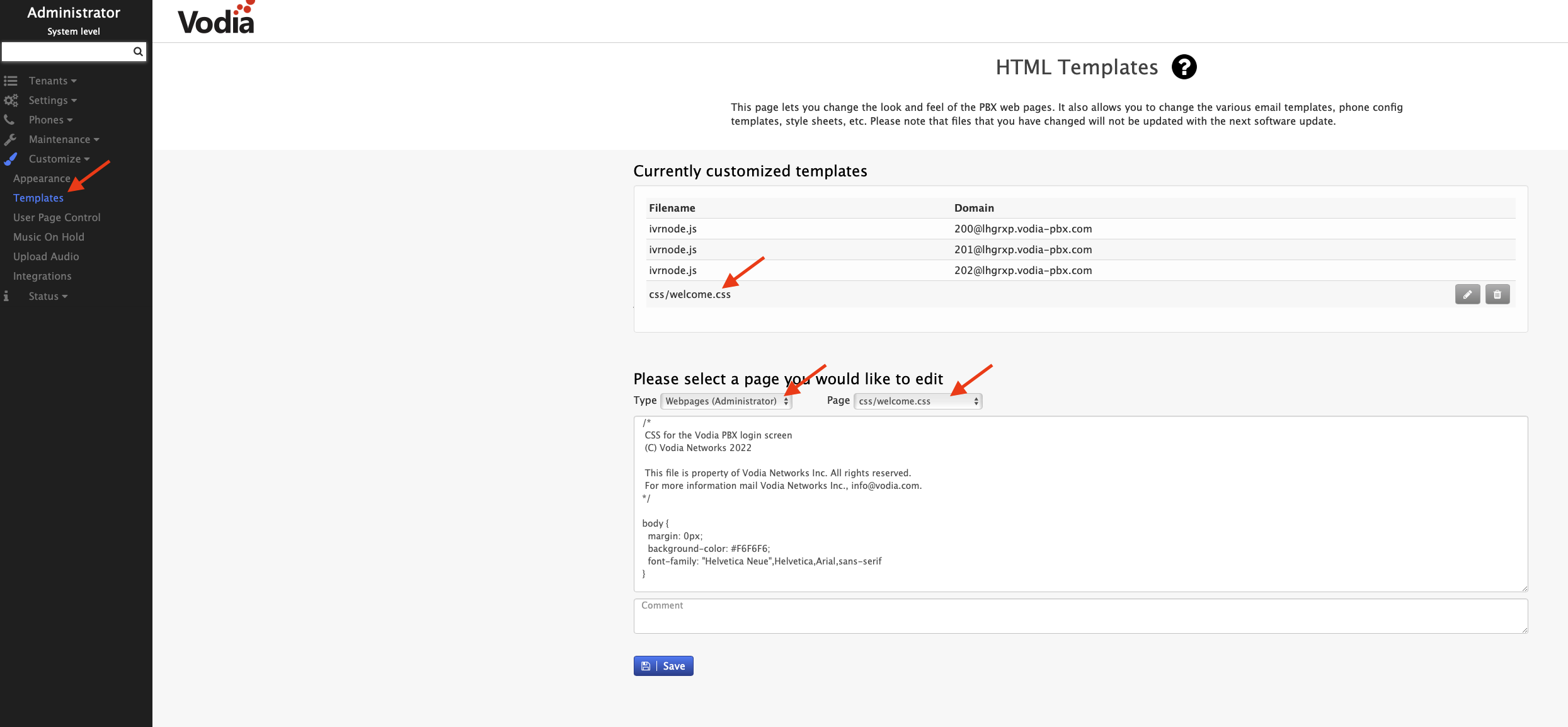
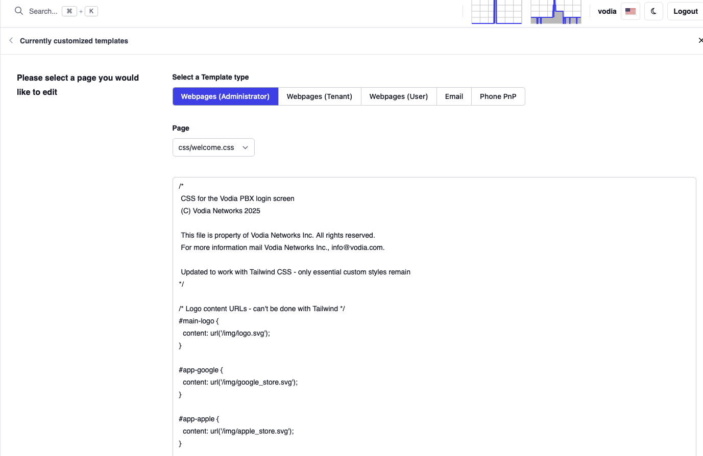
Login to the Vodia's portal as admin, then navigate to Customize → Templates.

  1. In the Type dropdown menu select Webpages (Administrator)
  2. In the Page dropdown menu select welcome.htm
  3. Scroll all the way down until [[copyright]] is visible and replace [[copyright]] with the desired text.

7. Favicon

Drop desired favicon named favicon.ico into the pbxwebai folder directly.

warning

Please clear your cache after applying changes in order to make sure your web browser is not serving saved assets.